Saturday, 12 May 2012

Lighting experiments


Before the Easter break, the group and i had a lighting workshop with Colin to finalise our lighting for our fashion shoot. Even though this workshop was purely based on a rough guide, it helped with positioning and type of lighting we would use for our shoot. We took this day as an opportunity to experiment with different lighting and how it could portray the type of narrative we are hoping to achieve. We tested several lighting and used myself as our stand in model, as i was similar height.

 
The image above shows what the set looked like without any lights. We used C-stands both heavy duty and  normal sized ones, to represent the trees in order to understand the placement of the model in correlation to the set. The heavier black stands represent the forefront trees, and therefore would be the ones that would defiantly be in crisp detail. Which was good about this day, was we learnt we didn't need any flats for our set, and learnt what sort of lighting and equipment we would need. This helped plan for our fashion shoot.
 
Above is the lighting diagram we produced at the end of the this workshop with Colin. We measured f/stop of the camera, the distance from the camera to the first two trees on both sides of the measurment from the  back wall of the studio to the postioning of the model. We will then correspond this to the design of the set on the actual shoot week.
The images below show the first set of lighting that we used. Two Arri lights one off the left side of the picture shining down onto the model and one Arri light down on the floor with blue gel over the top in order to represent where the fog would be and where the detail would be caught from the light.

This picture is the same as above, but with a branch coming across the frame. We portrayed this effect by attaching a branch to  a C-stand with some tape. We thought be experimenting with this effect it could perhaps look like we are looking through the woods, recognising her reaction towards her everyday occurrences.


The image above shows some lighting that was coming from the side of the shot. We decided to use polly boards as we had to find a solution to block out the light from the other group's lighting.
 
After discussions we decided to shoot landscape . In the images below you can see the positioning of the lights and the back light, which i suggested could be diffused more, as i think it could perhaps look too bright.
 
This is a miniature scale of the set with the leaves, trees and moss. Referring to the McQueen fashion week 2012 we wanted to create top lighting, so to create this effect we pierced a whole in the top of the phome, and a hole in the back to create low lighting for fog and detail of flooring. And the white figure in the middle represents the model.


This is an eye level picture, showing the top light over the model. We couldn't really see the 'effect' of this lighting with the studio lighting on so we switched the studio light off. We felt that the light didn't catch the model or really highlight any detail.


The  images below show how we achieved these 'experiments'. Even though we did not use any professional lighting we still managed to create a model from using our mobile phone lights, which gave us a chance to start thinking about the positioning of the lighting.


Visit to the forest......


Before our Easter break, my group and I had a meeting with Mike and Jonathan to discuss the issues we had surrounding the trees within the forest? Before this meeting, we as a group didn’t really think into detail what trees we would use in our set. We knew we wanted both straight and interwoven trees as this would represent the good and the bad. We also wanted to try and incorporate a pathway to represent her 'old life' and preferably use a crook to portray the uncertainty within her life and the unknown. But although we researched into forest imagery, we didn't know the 'types' of trees that would be found in everyday woodland areas. So Mike suggested we should take a trip down to the nearest forest and document what trees were seen and the note what the layout was like, in order to incorporate the style into our own presentation of the set.


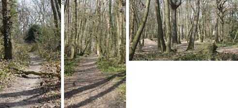
The images below signify the 'type' of flowers we found in the forest. We wanted to photograph the colour and type as this would help make our set more realistic.


In the photos shown below, we as group liked how the light captured detail in  the forefront, and added depth and other dimensions. In our shoot we are placing leaves on the floor, so we will also play around with this concept, of using light to create these effects. When taking these images we liked the idea of creating pathways, which lead  through different sections of the forest. As a group, we wanted to perhaps portray a similar scene, creating a pathway through our forest which would then lead the eye to the background of the trees, exploring how the pathway takes the viewer  back to 'normality' ; the life the character has left through the regulations and restrictions she had in life. 
When walking through the woods we came across many trunks which were  placed over pathway`s. We thought by portraying this design, it could represent a play on words, portraying a physical barrier for the character to overcome. The harsh shadows across the path also created detail and depth and added to the composition. The tall trees within the forest, i think added a slight overshadow which defined the fearures of the model, creating a scene which traps the character within her world. 

We then began documenting items we found within the wooded area that we could perhaps use in our set to make the scene look more relaistic and perhaps could symbolise meaning.  
Ivy was the most common item, it showed texture and detail. I was in particular interested in how it crawled up the trees, almost referring back to the narrative of the charcter escaping.


In the images below, we liked how the dimension gave definition to the composition. referring back to this idea, we thought we could perhaps use stumps to create a similar approach. 
 

We also looked at the type of leaves that were found in the forest. We want our set to look as realistic as possible so the majority were the same colour and texture- we wanted a mixture, otherwise we thought it would make the scene look quite flat and bland.

We also looked at the textures of the trees. Some  trees were flaky, and some were smooth. We looked at how the natural light played on these textures and how we could portray similar approach through useing lighting.


Started to document the types of trees; I liked the mixture of both straight and twisted trees. However these type of trees looked bare, I would like our trees to have some foliage, instead of having the idea of material. I think this would create an eerie place that is cut off from society.


Started to document the types of trees; I liked the mixture of both straight and twisted trees. However these type of trees looked bare, I would like our trees to have some foliage, instead of having the idea of material. I think this would create an eerie place that is cut off from society.
 
After finding suitable areas, we began taking photos of where the model could stand to gain the correct amount of shadow and detail, and how her relationship with the wood would create a sense of comfort or escapement.


Monday, 23 April 2012

model update!

After our tuturails, we came to the decision that our model we had in mind was not right for our narrative. We where asked as a group to search for another model that had the features we are looking for. The first step was to look through fashion magazines and cut out images that we thought were acceptable for the look we are trying to create. Later that day we took some photos of people we liked, but unfortuantly some did not get back to us. A week later, Christie emailed the group explaining :

` Just sent a friend request to a girl i have been trying to get hold of that i went to school with, who did some modelling for modelmayhem. she has accepted my friend request so if you like her I can see if she wants to be our model?. if we want chloe our original model, then thats fine I just thought i would give you the option. I can ask her and if she says no, then we have our back-up model `chloe`. This is what she looks like.......

tree searching....

Over the last couple of weeks, we have been having problems trying to source trees for our set. Sasha, a student of uca knows a tree surgent who was willing to help with the tree situation. We spoke to her last week and was told :

`her boyfriend has a couple of tree branches that he had collected. they are about 7ft and has got about 12. Emily from another group, also wants some of them. To be fair we agreed we could go halves with their group as its not fair that we have them all. We know her boyfriend (the tree surgent) is storing them for us till our shoot, but we need to transport them down to uni, therefore we will be talking to Johnathon about the situation. `

Luckily Martin from another group has offered to cut down some trees for our group aswell. His dad cuts down trees for a living and offered to cut a few down. We as a group agreed to this question and started cutting down at the weekend. Below are some photos of the trees we will be useing....


Tuesday, 10 April 2012

lighting diagrams

top lighting


easter work

After deciding what sort of tree's we would like for our shoot, we realised we as a group, did not need to build anything for our set, only borrow some 8ft real trees from a tree sergeant located in Maidstone. Luckily, Jonathon had the mans number, and therefore organised the amount (25) and type of trees we would like. After that discussion, we also realised we would need to buy some material for a grid, that we have to apply for holding the trees upright in the studio. I have already started collecting leaves for the flooring, and wood, bark etc.... for extra accessory. The fog machine i will be receiving this week, and have also produced some lighting diagrams for references to our set. This included... low lighting, top lighting , side lighting etc... Over Easter i also have researched into magazine articles that Jonathon gave us to explore which i think has helped choose the appropriate characterization for our chosen narrative. I took certain pages that i thought resembled our narrative and character, looking at pose and posture, and hope the references help when altering the corset and skirt. Below are some of the magazines that i have started to explore....
- 125 magazine
- Tank book
- W magazine
- Purple magazine
- Wallpaper magazine
- Italian vogue
- British vogue


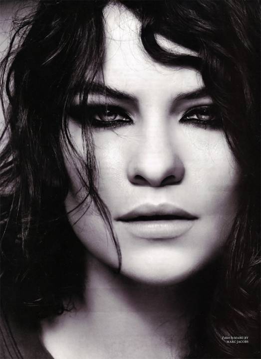
Above is the model and look we are hoping to achieve….!
Lindsey Wixson is one of this seasons ‘breakout models’. Known for her defined ‘bee sting’ pout and gapped front teeth, she has managed to land major campaigns such as Alexander McQueen and Miu Miu. She began modelling in 2009 after leaving Wichita, Kansas were she was born and bred. At the age of 15, esteemed photographer Steven Meisel hand picked her for a shoot with Italian Vogue, opening many more doors for her to lead the way. For fall she walked 44 runway shows in New York, Milan and Paris and had her first major magazine cover for i-D. She is currently with Marilyn model agency, and think her make-up pose and stare is exactly what we as a group are looking for, something suggestive yet not too obvious.
 
Steven Meisel (born 1954) is an American photographer, who obtained popular acclaim with his work in US and Italian Vogue. He is now considered one of the most successful fashion photographers in the industry, shooting regularly for both US and Italian Vogue, and lately W (also edited by Condé Nast). This post contains 16 delightful photographs of Steven Miesel, titles “Garden of Delights”.
I thought about researching into his style of work, as the images explore with forest scenery. I thought this could perhaps help with poses, type of clothing, hair and make-up and set build.


 When observing all images above, i really like picture 1, as the i think the pose and the stylising of model is perfect to what we as a group have in mind for our narrative, the glare expression into the audience portraying a sense of maturity yet unknown, and features of the model creating a harsh quality. (someone you would not like to meet, whilst in a forest)


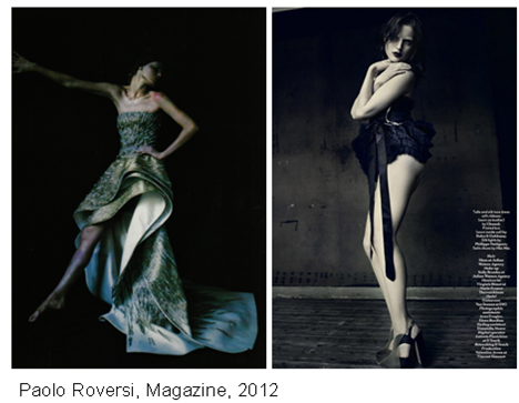
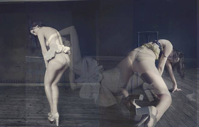
From the magazine selection, i chose these photos as i thought again, the posture, and styling was really beneficial when choosing and trying to incorporate the correct characterisation for our chosen narrative. In particular i like image number 3, as i think the pose that the model portrays against the chair reflects an awkwardness and almost refers to the metaphor: held as a prisoner in her own world. Somehting that i think  incorporates well into our narrative :  escaping for her traditional ways, becoming mature into the unknown world.
The costume in image 7, i really admire, i love the braiding texture on the garment, portraying a classical look yet i think revealing a sense of maturity through flesh and costume.
 
 
After researching into several magazines and websites I found a designer called Nichole de carle, who creates unique designed underwear that resembles the type of feedback we as a group received for clothing options. Even though these designs are completely out of our price range, I thought it was a good starting point of what we might want to consider. Over Easter I am currently looking into high street stores, who do similar designs for cheaper price.  I think our group are considering changing the costume to something similar to the images below (not sure) but perhaps Laura could ask her fashion friends if they could perhaps alter the corset or make/ design something similar.

The photograph below, I think shows a dissimilar side to Britain’s fashion; Kate Moss has been placed in what looks like an old vintage British house with a classic red chair. The chair could represent the person that lives there, and symbolizes how objects within a house can describe a person. The colours on the wall are neutral and patchy; this could resemble the age of the house and the colours of the wall and chair could also be placed in those areas to clash with the garment and the models pose and expression.


Her facial expression is seen as seductive something worth considering for our character within our narrative ( a girl becoming a women?) I like how she looks directly at you, drawing your attention. Also the pose is also seductive, with her legs apart and hips forward, portraying a suggestive manner.  The garment that Kate wears is elegant which you could imagine someone wearing at a ball or wedding but I think the designs have been clever as they have altered the garment to resemble a modern twist. The union Jack blazer I think contradicts the dress nicely. And the blazer, knickers and shoes all seem to portray a more punk version of British fashion unlike the traditional elegant fashion.


For a few weeks it's been repeatedly mentioned that we need to alter our costume as it needs re-modernising and reconstructed into something similar to the magazines I have been exploring e.g.…..
During out tutorials its been repeatedly said about the importance of the fashion in the image. As the styling constructs and can explain the narrative chosen. I must admit, I know little about fashion but after our meeting with Jonathan, I was a little concerned due to the little amount of knowledge the group and I have. Over Easter I have been looking into the fashion industry identifying photos that I think could fit our concept.
I have only started to look into this type of research which is identifying high street shops that sell items that are linked with our character. Ideally looking into corsets or Basques ….